Solely Vitamins
Identity and packaging design for a vitamin brand that fights against one-size-fits-all solutions by only offering single letter vitamins.
IDENTITY DESIGN PACKAGING BRAND STRATEGY


Vitamins have become a hot commodity, with catchy phrases for names and hard-to-ignore promises. Taking multivitamins can be more manageable and accessible, but you're usually taking unnecessary additional vitamins.
As health consciousness becomes a more critical factor in markets worldwide, companies often sell a lifestyle in the place of products. Solely, at its very core, is a company selling you vitamins and nothing more. Fitting into your lifestyle is an added bonus.
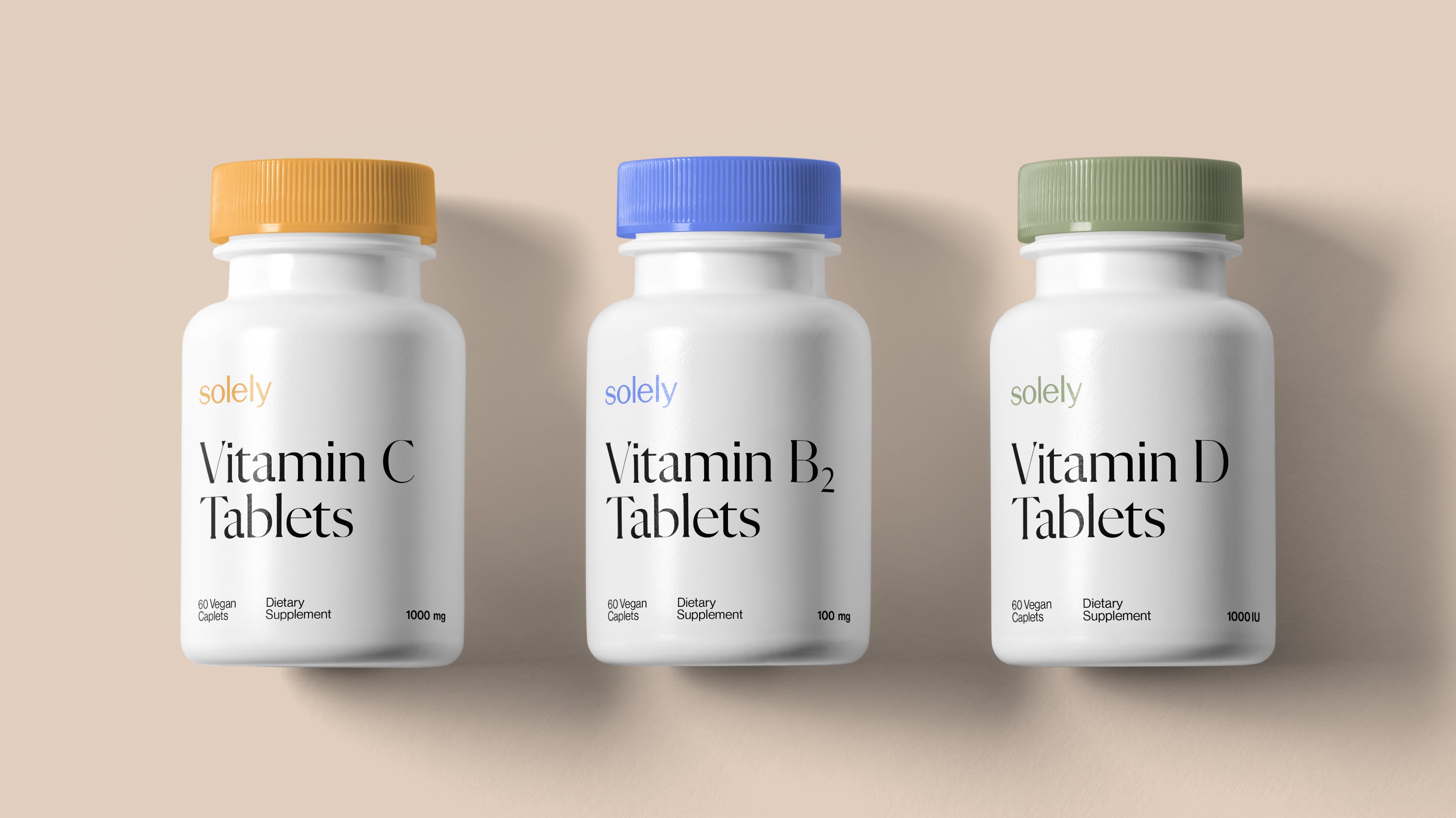
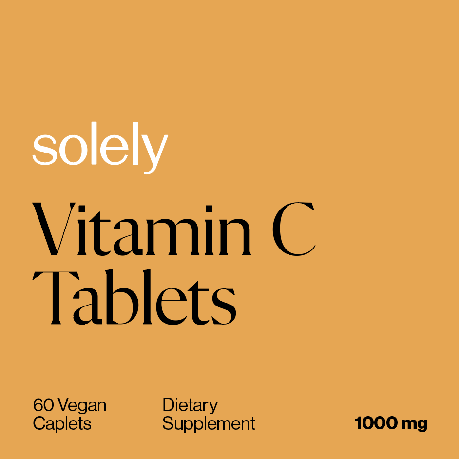
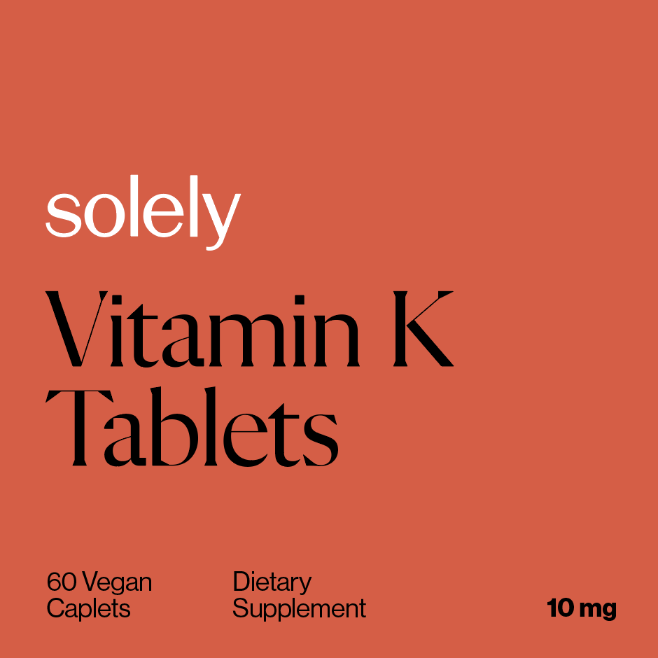
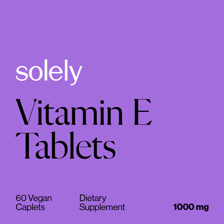
The resulting branding and communication reflect Solely's strategy of complete honesty and transparency. Starting with the name, all the way up to the products themselves, it’s clear that, with Solely, what you see is what you get. The overall identity looks clean and concise, reflecting brand values.
As health consciousness becomes a more critical factor in markets worldwide, companies often sell a lifestyle in the place of products. Solely, at its very core, is a company selling you vitamins and nothing more. Fitting into your lifestyle is an added bonus.
The resulting branding and communication reflect Solely's strategy of complete honesty and transparency. Starting with the name, all the way up to the products themselves, it’s clear that, with Solely, what you see is what you get. The overall identity looks clean and concise, reflecting brand values.
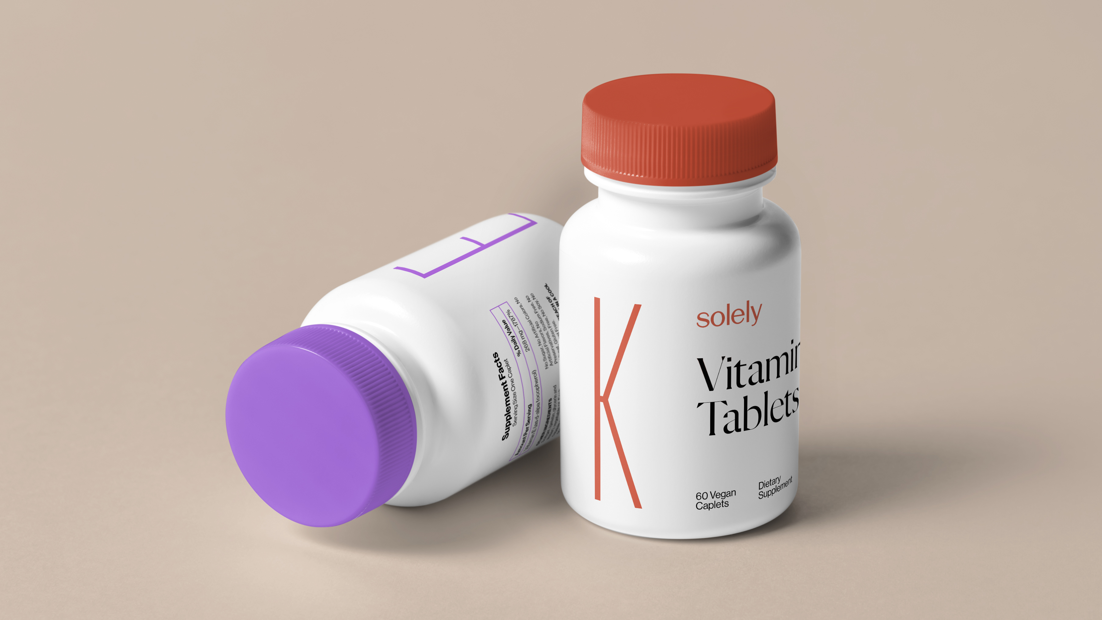
Appointing a color to each vitamin helps distinguish between vitamins, but for those with color blindness, color coordination is neither sufficient nor reliable. Large letters accompany the color-coded system, so people with visibility issues can identify each vitamin efficiently and with ease.
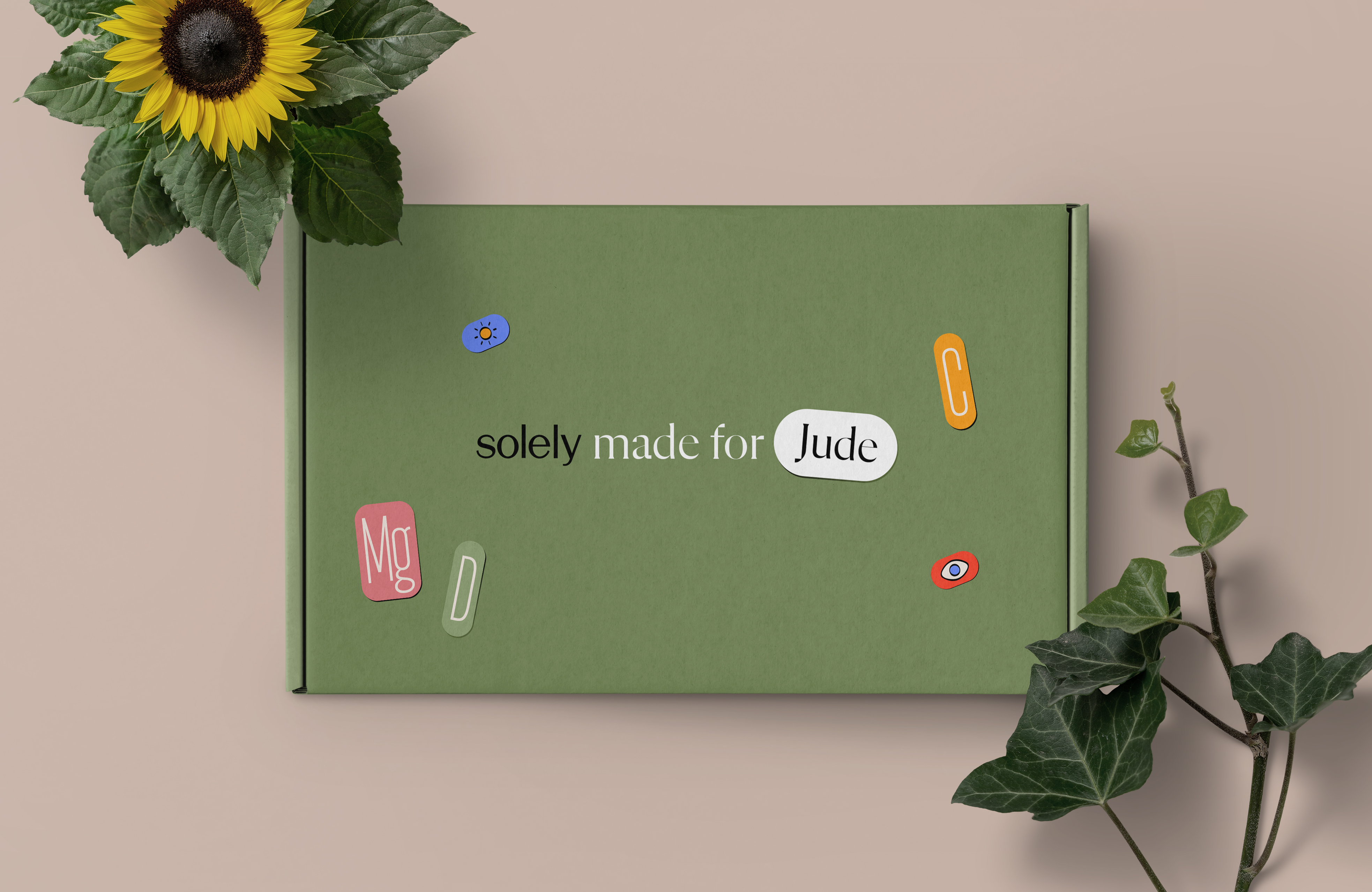
Customer names are printed onto stickers that are then added to shipping boxes, along with fun iconography denoting different vitamin properties—a small touch that personalizes each box.
Customer names are printed onto stickers that are then added to shipping boxes, along with fun iconography denoting different vitamin properties—a small touch that personalizes each box.