Modern Pinball NYC
WARNING
Some visuals may trigger seizures for people with photosensitive epilepsy.
Rebranding a pinball arcade to convince today’s kids to put down their smartphones and fancy game consoles to enjoy some good ol’ retro fun.
IDENTITY DESIGN MOTION

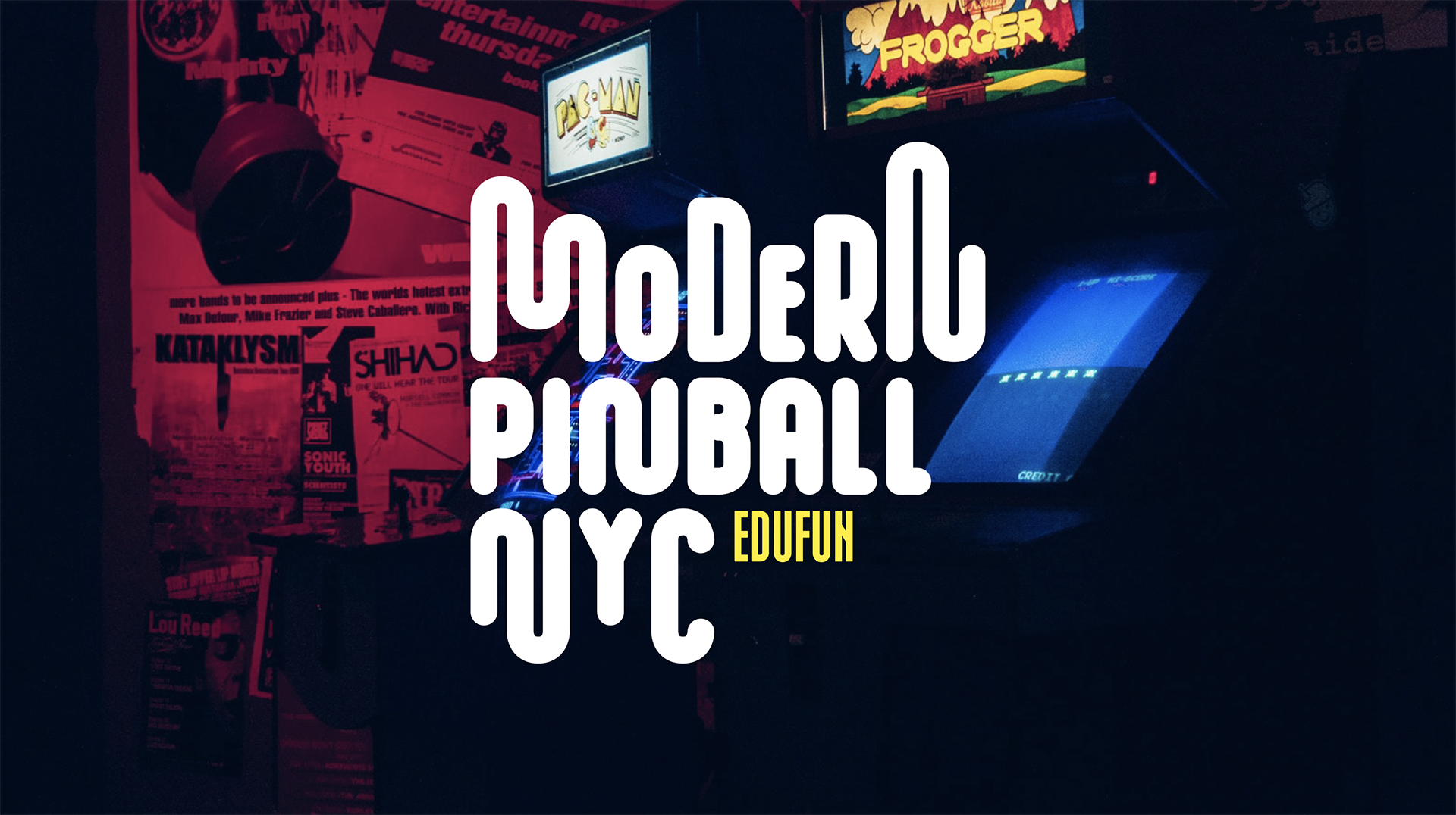
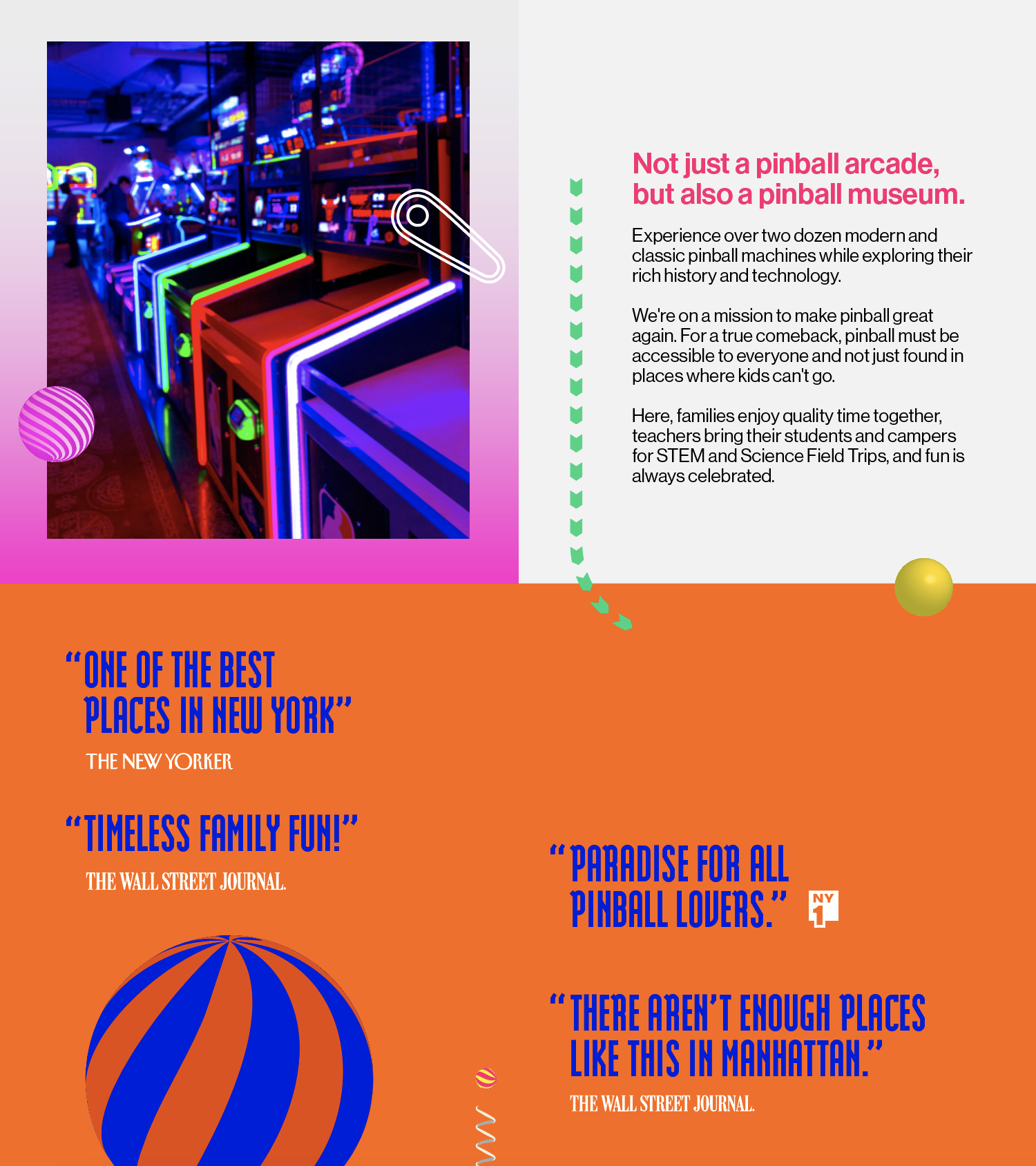

Pinball, to fewer and fewer of us, is nostalgic. Today, we can find them in a couple of bars, catering to the now adults who once raided arcades in their youth. Modern Pinball NYC aims to change that by bringing pinball back for the entire family to enjoy. The problem is that for kids today, pinball isn’t nostaglic—it’s ancient. They grew up with advanced technology, and if they ever played a game of pinball, it was probably on a computer. Lining up outside an arcade to play pinball is unknown territory.
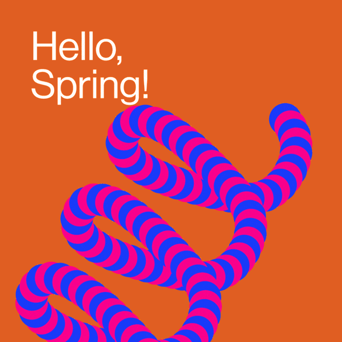
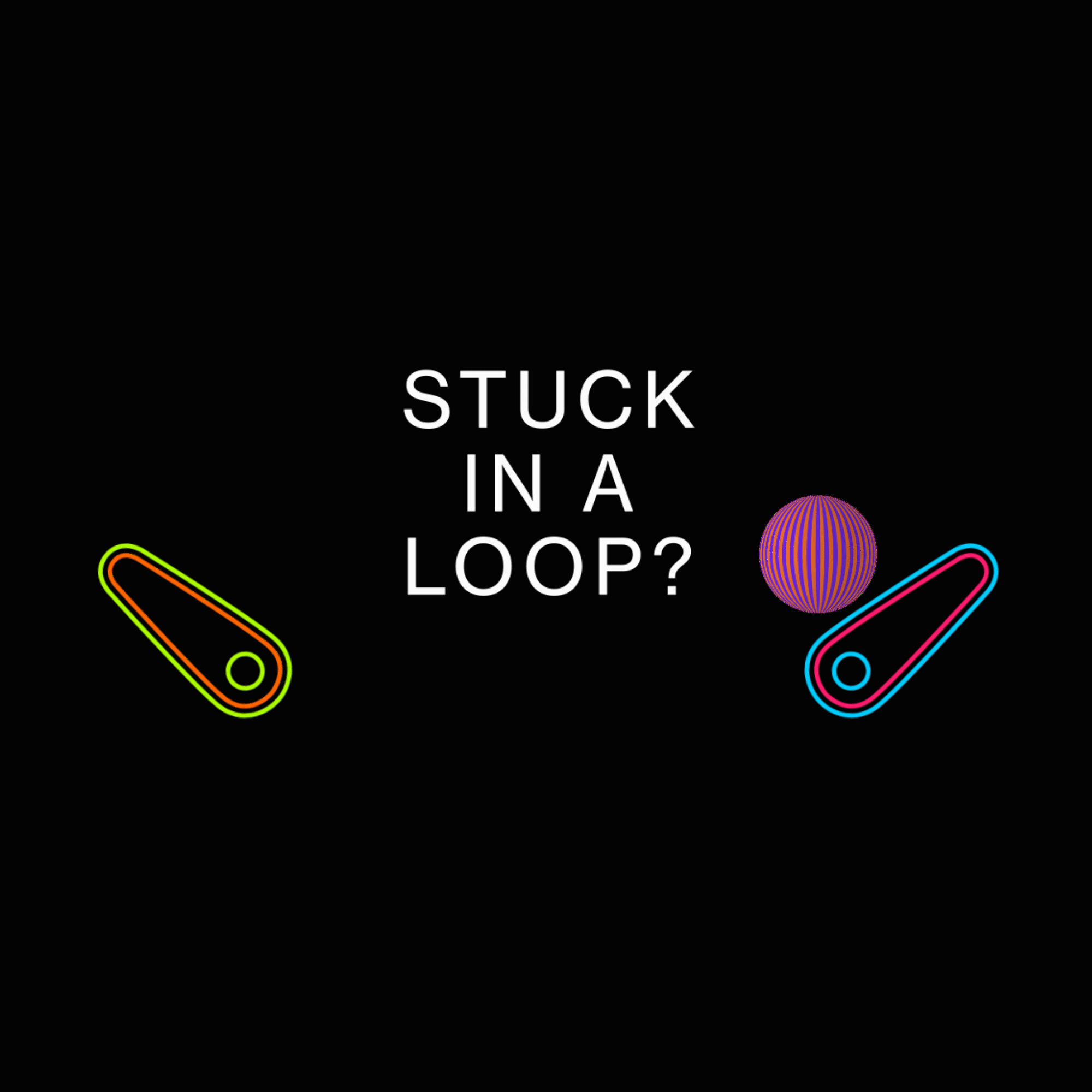
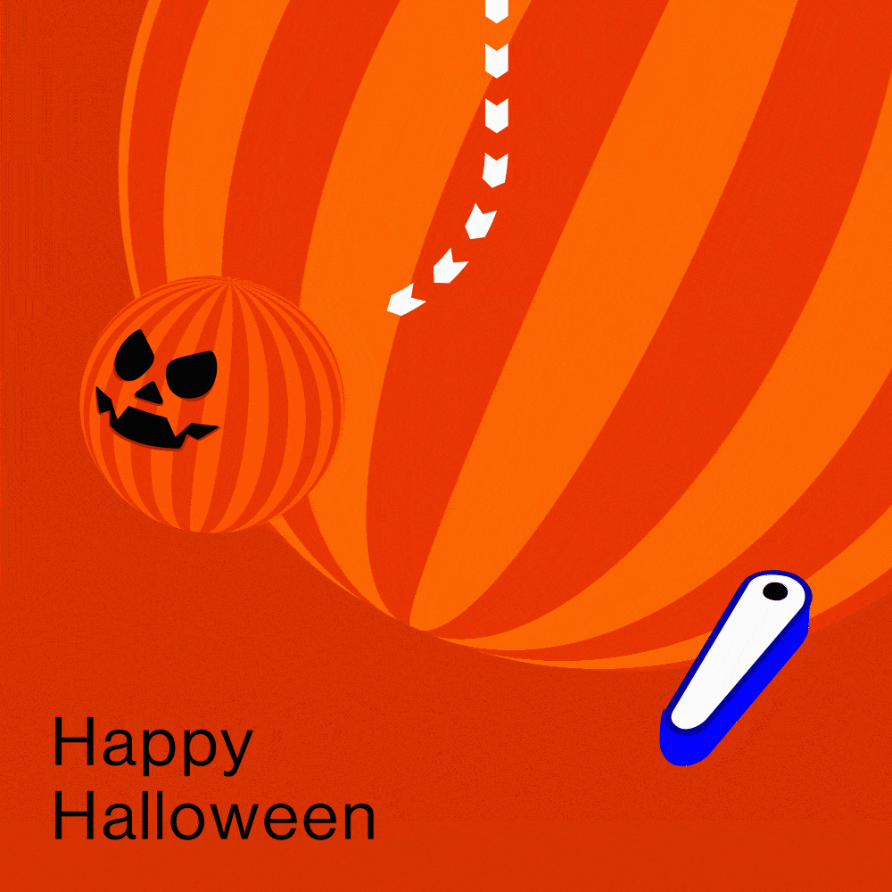
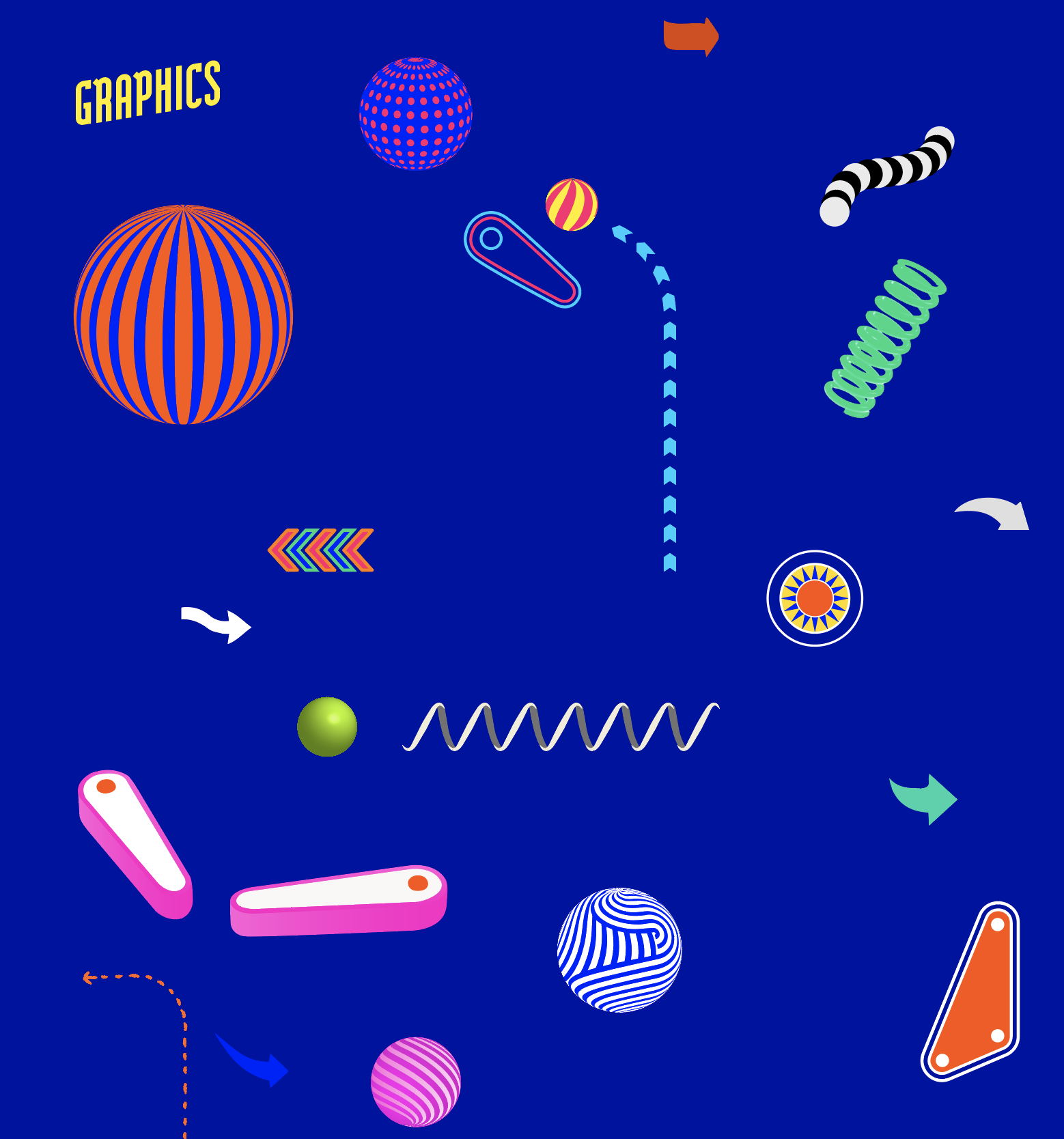
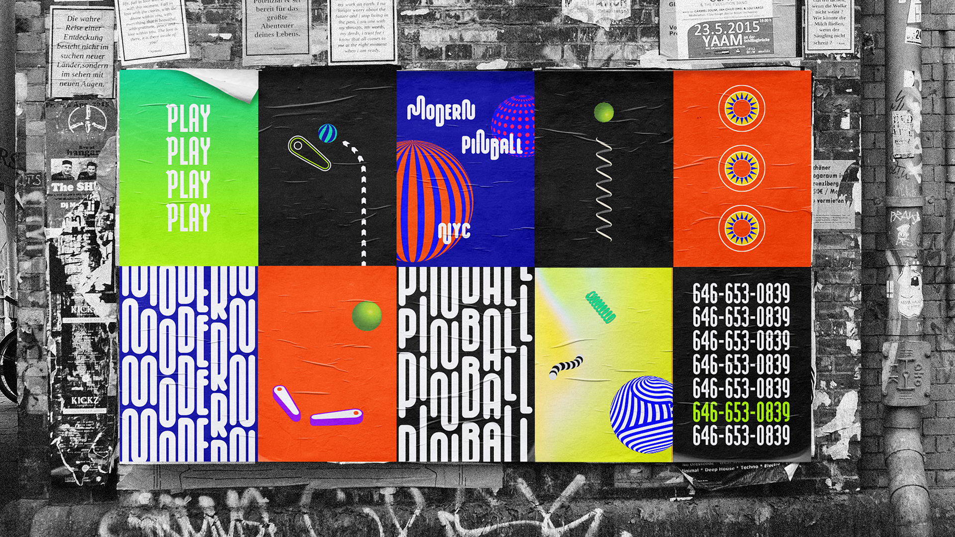
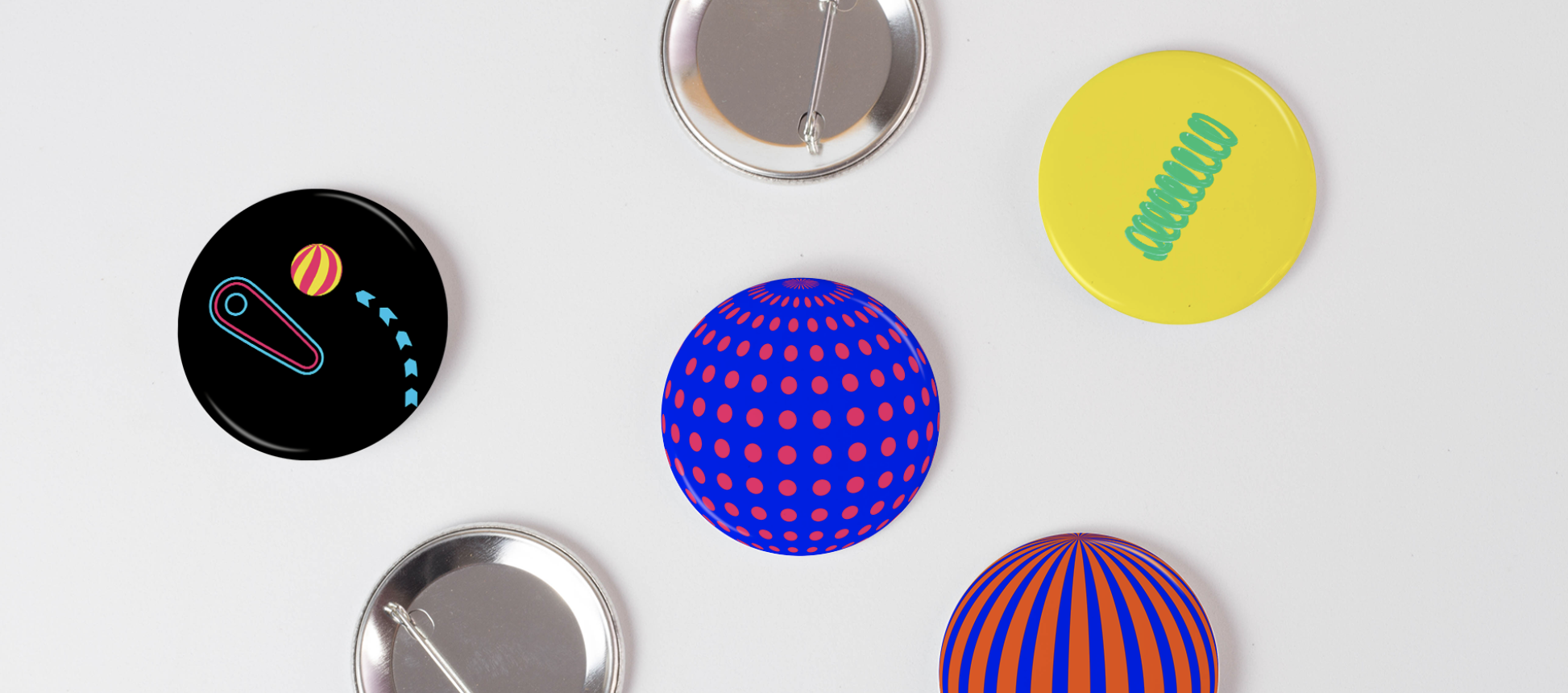
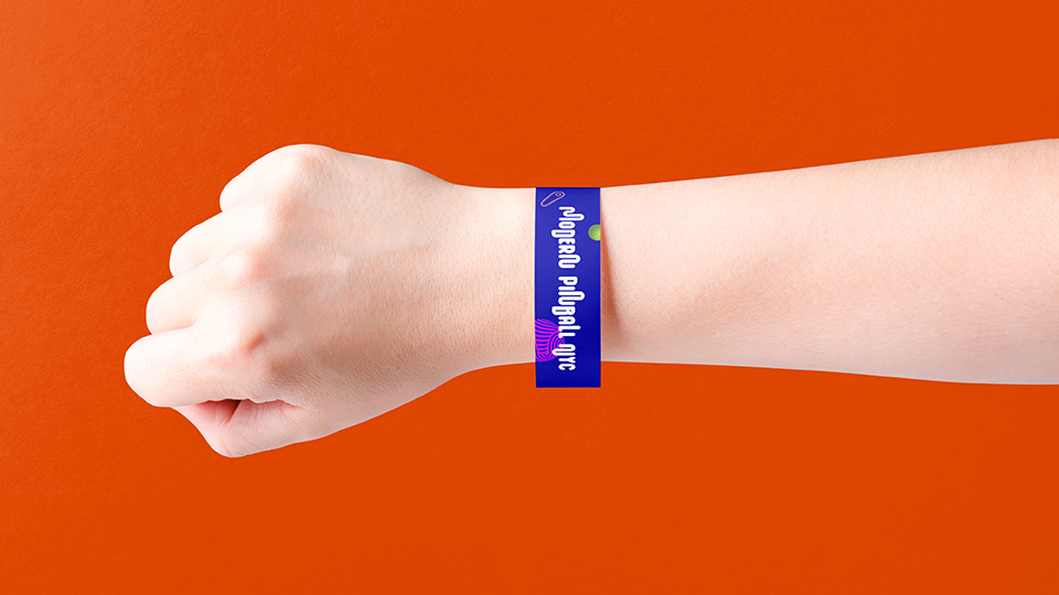
I created the graphics and illustrations intending to mix 3D, of-the-now visuals that would be both familiar and exciting for children to look at, with a nod to our nostalgia and its 2D ways, back when pinball was in its glory days. Movement is at the heart of Modern Pinball NYC's identity to capture the game’s energy. The colors are bright and flashy, with a wide enough range to create variance between layouts and still work well as a family.
I created the graphics and illustrations intending to mix 3D, of-the-now visuals that would be both familiar and exciting for children to look at, with a nod to our nostalgia and its 2D ways, back when pinball was in its glory days. Movement is at the heart of Modern Pinball NYC's identity to capture the game’s energy. The colors are bright and flashy, with a wide enough range to create variance between layouts and still work well as a family.
Paying homage to older and simpler times, I used Modula OT, designed in 1985 by Zuzana Licko of Emigre, whose intention was to create a computer font with forms that should "result as an integral part of the digital process, not in spite of it." I tried to carry this way of thinking into the rebranding of Modern Pinball NYC, embracing our digital world by bringing pinball back into it, not in spite of it. I paired Modula OT with Neue Haas Grotesk to help lighten the intensity of an already loud identity.
Ultimately, Modern Pinball NYC is a place where fun is always celebrated, so it only felt fitting that the identity really celebrated fun.
Ultimately, Modern Pinball NYC is a place where fun is always celebrated, so it only felt fitting that the identity really celebrated fun.